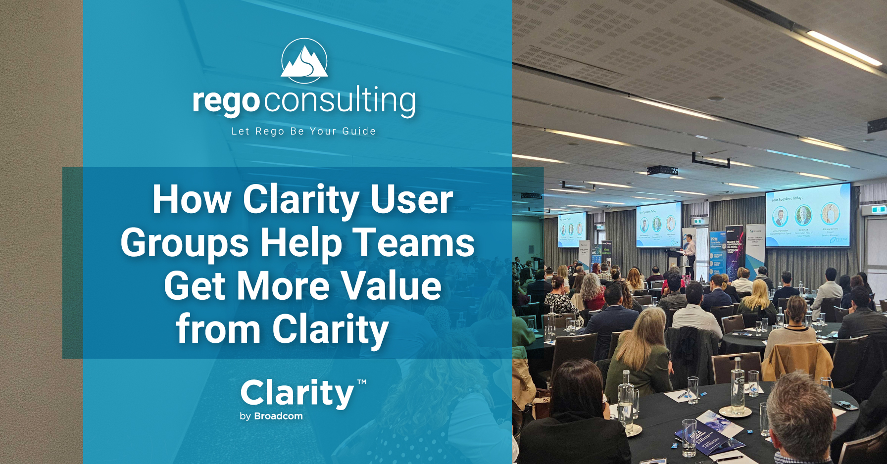
Extract, Visualize, and Analyze Your Clarity Data
Do you want to harness the power of your Clarity data to ensure decisions are aligned with your strategic goals?
 At last year’s Rego University (2022), we had a fantastic opportunity to get together and listen to our clients. They told us how much they wanted to leverage Clarity’s rich, powerful data to help all their stakeholders make data-driven decisions.
However, many clients were struggling with how to pull together dashboards with easy-to-use views based on different interests. There was so much great data but presenting that data in a way to help stakeholders make decisions was proving difficult.
Our clients explained that they did not have the time or resources to develop in-house solutions. However, their internal and external stakeholders (leadership, customers, vendors, etc.), needed to visualize and analyze Clarity’s amazing data at-a-glance.
These types of insights would drive opportunities to reduce costs, save time, increase revenue, and ensure work was being tied to organizational goals. They convinced us that powerful dashboards would have a HUGE impact on their organizations.
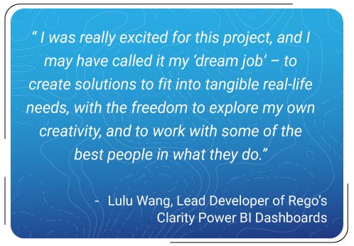
And so, based on the incredible feedback and ideas from those RegoU conversations, Rego’s Clarity BI Dashboards were born. Over the next year, Lulu Wang and our most experienced functional experts created dashboards that would help keep Clarity “sticky” in organizations, while providing helpful insights that would drive better, faster decisions.
Clarity Power BI Dashboards
Now, with Rego’s new Power BI Dashboards you can harness the power of your Clarity data to engage every stakeholder, even if they prefer to get their information outside of Clarity. Each dashboard can be connected to your organization’s intranet, making it easy for anyone to see up-to-date metrics in a place they are already familiar with.
Choose from eight sets of dashboards, with over sixty views total. You can get them all or pick the ones that fit your organization’s needs. And because these views are customizable, you can adjust them, turn off views you do not need, or even connect other sources of data to your Clarity Data. You can even switch your dashboards to dark mode if you prefer a different aesthetic. The possibilities are endless!
Each dashboard set is designed to help you extract, visualize, and analyze your Clarity data.
These dashboards include:
Idea Summary Dashboard
This dashboard kit helps you visualize and analyze work requests, prioritize ideas, assess their feasibility, and track progress so that you can ensure the most valuable ideas are being moved forward.
Features:
- Scorecard/Executive view to assess ideas progress, risks, issues, statuses, blocks, and allocations
- Summary view to filter ideas by their statuses, priority, type, category, and goals
- Idea Bubble Chart view to help visualize ideas quickly
- Gantt view to gain a timeline based on idea status, priority, type, category, or goal
- Funnel view to easily analyze planned costs and benefits alongside other idea data
- Status Report view to summarize all status reports, including overall status, schedule status, scope status, and cost effort status
- Risks view to identify risks by owner, priority, category, status, or investment
- Issues view to highlight issues by category, owner, priority, status, or investment
- To Do view to understand completed and upcoming To Dos
- Staffing, Effort, and Cost view to help you analyze ideas by manager, resources, and financials
Portfolio Summary Dashboard
Easily analyze in-flight work and identify what is on time, what is stalled, and what might not be producing value, so that you can ensure the most valuable work is completed on time.
Features:
- Scorecard/Executive view to easily visualize and analyze your portfolio by investment manager, investment type, goal, individual investment, or hierarchy
- Gantt view to assess your portfolio by swim lanes and milestones
- Status Reports to quickly see missing and at-risk status reports, as well as sort by overall status, deliverable scope changes, review approval problems, schedule status, milestones on track, required scope changes, scope statuses, project external factors, staffing issues, cost effort, and project objective changes
- Change request view to manage requests and view the impact of changes by cost, schedule, resources, approval rate, and more
- Risks view to highlight risks that are open or in progress by owner, priority, category, status, and investment, as well as a risk summary
- Issues view to gain a bird’s eye view of issues by number, type, top investments, how long issues have been open, and more
- Effort view to display effort completed versus effort allocated, actual hours, base hours, EAC hours, allocation hours, ETC hours and more
- Cost view to track financials and understand actual cost versus budget, cost burn, base cost, EAC cost, allocation cost, budget cost, planned cost, forecast cost, ETC cost, and more
- Effort Trend view to see actuals and EAC hours trends and trends for allocations by goals
- Cost Trend view to analyze CapEx and OpEx budget, planned cost, and actuals
- Milestone view featuring summaries to identify off track, at risk, and on track milestones
- Tasks view to see and prioritize upcoming tasks
- Staff and Assignments view to identify staffing opportunities and over allocations
Investment Roadmap Summary Dashboard
This dashboard pack enables you to look ahead, compare in-flight and upcoming work, assess different scenarios, and make the best possible plan for the future.
Features:
- Default Scenarios view to summarize multiple roadmaps together and analyze finances, capacity, and items
- Single Roadmap Summary view to analyze the finances, capacity, and items for a single roadmap
- Roadmap Item Financials view for rich financial analysis of CapEx or OpEx insights, total cost, actual cost by investment type, total cost by investment type, and more
- Investments view to understand actual investments, which could differ from the roadmap itself, but provides an added lens for decision making
- Scenario Comparison view to compare different scenarios in-depth including cost and capacity
- Roadmap Item Gantt view to assess and sort items by investment type, investment status, investment category, stage, investment manager, and idea project type
- Investment Gantt Milestones view to assess and sort milestones by investment type, investment status, investment category, stage, investment manager, and idea project type.
- Role Capacity Versus Demand view to identify availability and over allocations for individuals and roles
- Demand by Investments view for comparison of investment demand by month or stage, as well as top demanding investments
Timesheet Compliance Summary Dashboard
This dashboard set helps you ensure your team members are working on the right initiatives, spot variances, and identify missing timesheets and bottlenecks.
Features:
- Executive Dashboard view for quick insights into how many hours are compliant, how many hours are on timesheets, how many resources did not submit timesheets, how many timesheets are waiting on approval, how many resources did not work on allocated assignments, and how many hours are CapEx versus OpEx
- Timesheet Details view for a detailed breakdown of timesheets by resource manager, resource OBS, resource class, employment type, vendor, department, or role
- Resource view to see details on individuals, including missing timesheets and compliance
- Hours view to view trends on hours, missing hours by manager, top consuming investments and tasks, as well as hours by resource manager and resource
- Timesheets Needing Approval view to identify timesheets that have been submitted but are missing approvals
- Capital Actualization view to provide analysis of timesheet entries for both CapEx and OpEx
- Allocation Discrepancy view to identify individuals that are working on tasks and projects that are different from the ones they were assigned
Resource Management Summary Dashboard
This dashboard pack enables you to reduce overallocations and ensure work gets done on time using resource management insights.
Features:
- Executive Dashboard view to evaluate the allocation percentage for the coming weeks, the percentage of ETCs versus Availability in the coming weeks, how many resources did not work on the allocated project assignments, how many timesheets are compliant, how many hours are on timesheets, and how many resources did not submit timesheets
- Staffing by ETC view for analyzing ETCs by investment type, goal, cost type, priority, department, charge code, overall status, investments with the top ETC hours, and more
- Staffing by Allocations View to determine where resources are charging hours to, top allocated investments, allocations for the upcoming weeks, and more
- Past Allocation History view to spot patterns of allocation discrepancies over time
- Timesheet Details view to gain visibility into timesheets for resources and the work they have completed
- Hours Detail view to assess hours for weekly trends, top availability, missing hours by manager, and more
- Capital Actualization view to understand how resources impact capital versus operation expenditures for a given period
- Resource Detail view to identify individuals with the most availability, top utilization, missing timesheets, timesheet compliance and more
- Skill Matrix view to visualize resources and their availability based on their skill sets
- Investments, Tasks, and Actuals view to understand top consuming investments and tasks, where resources are entering their hours, project and task details, and more
Financial Summary Dashboard
This financial dashboard is designed to help financial stakeholders, like executives, easily view and analyze how money is being spent on projects, what financial benefits work is projected to generate, compare budgets to actuals, and more.
Features:
- Financial Summary view for financial stakeholders to easily summarize actual cost, plan cost, forecast cost, budget cost, planned benefit, and more. You can filter data by investment type, investment manager, investment, progress, goal, stage, or hierarchy.
- Actual Versus Planned Cost view to identify variances and ensure spending is prudent
- Plan Benefit Versus Actual Cost view to evaluate how plan benefits compare to actual costs, and ensure that the right amount of revenue will be generated for continued effort
Program Summary Dashboard
For those using the Program object from Clarity Classic, this dashboard kit will help you ensure that the most valuable work is being completed on time. Analyze in-flight work to identify what is on time, bottlenecks, and sunk costs.
Features:
- Scorecard/Executive view to easily visualize and analyze investments by status, schedule status, scope status, or cost/effort status. You can also view Issues by priority, Risks by priority, Critical Milestones, and ETC Hours.
- Gantt view to assess your programs by swim lanes and milestones
- Status Reports to quickly see missing and at-risk status reports, as well as sort by overall status, deliverable scope changes, review approval problems, schedule status, milestones on track, required scope changes, scope statuses, project external factors, staffing issues, cost effort, and project objective changes
- Change request view to manage requests and view the impact of changes by cost, schedule, resources, approval rate, and more
- Risks view to highlight risks that are open or in progress by owner, priority, category, status, and investment, as well as a risk summary
- Issues view to gain visibility into issues by number, type, top investments, how long issues have been open, and more
- Effort view to understand effort completed versus effort allocated, actual hours, base hours, EAC hours, allocation hours, ETC hours and more
- Cost view to track financials and visualize actual cost versus budget, cost burn, base cost, EAC cost, allocation cost, budget cost, planned cost, forecast cost, ETC cost, and more
- Effort Trend view to see actuals and EAC hours trends and trends for allocations by goals
- Cost Trend view to analyze CapEx and OpEx budget, planned cost, and actuals
- Milestone view featuring summaries to identify off track, at risk, and on track milestones
- Tasks view to see and prioritize upcoming tasks
- Staff and Assignments view to identify staffing opportunities and over allocations
Work Management Summary Dashboard
This view is helpful for individuals who want to see work they need to accomplish, or for supervisors to visualize what their resources are working on.
Features:
- Scorecard view offers a summarized view of To Dos, Tasks by priority, Critical milestones, Issues, Risks, and Changes by priority. You can filter this data by resource manager, investment manager, or investment.
- To Dos, Tasks, and Milestones view for insights into which To Dos, assigned Tasks, and Milestones are overdue, upcoming, or completed
- Risks, Issues, and Changes view to help prioritize work based on Risks, Issues, and Change Requests. Like the other Work Management views, these can be filtered by resource manager, investment manager, or investment.
- Board view to visualize work that is not started, started, or completed
- Calendar view to see a calendar of upcoming work by day, week, month, or in a list view. This view can be filtered by resource manager, investment manager, investment, overdue, completed, priority, status, and more.
- Gantt view to gain insights and prioritize work using a Gantt chart layout
Adoption Dashboard
The Adoption Dashboard is designed to enhance data integrity and project tracking within Clarity by providing insights into how well users are populating and managing their project and resource data.
Features:
- Project Data Quality
Evaluate the accuracy of project status reporting, risk, issue tracking, and schedule adherence. - Resource Data Quality
Assess how well resource managers are managing timesheets, allocations, and actual utilization. - Adoption Scoring View
Rate the consistency of data entry across projects and resources on a scale of 0-5, helping identify areas needing improvement. - Variance Analysis View
Track discrepancies in project schedules, effort, budgets, and resource commitments.
Free Clarity Power BI Dashboards
Since we designed these dashboards based on our clients’ feedback, we wanted to make them as assessable as possible. So, they are all available for free! And, if you do not want to install them or configure them yourself, our Rego experts are available for just a few hours of set-up and training time.
All these dashboards are certified for Clarity 16.0 and higher, but if you have an older version, we may be able to assist you with getting them installed, too.
If you would like any of these new dashboards, visit xchange.regoconsulting.com and use a free theBasiX account to get yours now!