
Understanding What Clarity’s Modern UX Is
Before we review migration steps, it is important to understand what the Modern UX is, and what it is not.
The Modern UX is not:
1. A new “look” or “skin” for Classic
The way users interact with Clarity as well as the core functionality has been reimagined. Additionally, new features and functionality unavailable in Classic are consistently being added with Broadcom’s quarterly release schedule.
2. A replacement for Classic
Broadcom approached development of the Modern UX as a PPM innovation and did not port all capabilities like-for-like.
3. New
The Modern UX was originally introduced in version 15.1. However, it has evolved significantly with a quarterly release schedule.
The Modern UX is:
1. Available side-by-side with Classic
With the exception of Timesheets, users can toggle between the two experiences. Noting support considerations, of course.
2. The focus of future innovation
The Modern UX is the primary focus of Broadcom’s Research and Development investment.
As you prepare to gain stakeholder buy-in, be sure to explain what the Modern UX is – especially that both the Modern UX and Classic can exist side-by-side, allowing you to turn on and off features that make sense for your organization.
Making the Case for Modern UX Migration
![]() Once you are familiar with what the Modern UX is, the first step toward a successful migration is gaining stakeholder buy-in. To do this, you must answer the question, “Why should we migrate?”
Once you are familiar with what the Modern UX is, the first step toward a successful migration is gaining stakeholder buy-in. To do this, you must answer the question, “Why should we migrate?”
Remember, all future Clarity innovation will be on the Modern UX – that is a huge motivator.
And while the “why” may be slightly different for each business, there are some Modern UX selling points that we have seen resonate with clients again and again. These include:
Increased Adoption with Common Grid, Board, and Timeline Views:
You can start by acknowledging some of the gaps in Classic functionality that are offered in the Modern UX. Many organizations are looking for easy-to-use features, auto-populating grid views, drag and drop functionality, etc. The Modern UX is great for driving Clarity user adoption because it has all the shiny bells and whistles organizations have come to expect from modern software, while Classic still mirrors a user experience from the early 2000s.
Some “sticky” views that users really like include Common Grid, Board (Kanban), and Timeline (Gantt) views. Additionally, views are a lot more collaborative in the Modern UX. If you want to share views, you no longer need to take a screen shot. You can just have someone check out your view in Clarity and duplicate it for themselves. The Modern UX also has other improvements for ease-of-use including copy and paste functionality, much like you would find in Microsoft Excel.
Easy-to-Use Blueprints:
Modern UX Blueprints enable you to customize how your Projects, Ideas, Custom Investments, and Hierarchies look and feel, based on your business goals. Blueprints save time and are easy to use because they do not require different page layouts, partitions, or deep technical knowledge to leverage. Making changes or modifications can be done effortlessly, and Blueprints are more interactive and readable for end-users. They can also change by stages and be used creatively based on your specific needs.
Timesheets Improvements:
It is helpful to call out improvements for Timesheet users, because they are one of your largest Clarity user groups. With the Modern UX, users can take advantage of the mobile timesheet app, which makes tracking time on the go easy. Another big win for Modern UX users is the ability to easily export timesheet data as .xlsx or .csv files. This is especially helpful for contractors who need to export timesheet data for their own organizations.
Project Manager Flexibility:
There is greater flexibility for Project Managers to work the way they want within the Modern UX. There are several ways to view tasks including a Kanban view, a grid view, and a timeline view. Project Managers can customize their picklists without an admin. It is also easier for project managers to collaborate within Clarity using the Conversations feature. Additionally, Checklists/To Dos have also been added to capture and track work items that do not necessarily equate to a task.
Greater Strategic Alignment with Roadmaps and Hierarchies:
Two of the most powerful additions to Clarity’s Modern UX are Roadmaps and Hierarchies. Roadmaps and Hierarchies paint a clear picture for not only your Clarity users, but also for upper-level management. You can use these tools to ensure strategic alignment by building out multi-year roadmaps, visualizing how your investments roll up to key strategies or themes, setting targets for forecasting, and more. Roadmaps and Hierarchies act as a bridge to engage executives so they can visualize how their investments are performing.
One surefire way to gain buy-in is to get your current Clarity user base a demo of the Modern UX. We find that most Clarity Classic users are so surprised by the user-friendly interface and added capabilities, that it makes migrating a no-brainer. If you would like help getting a demo set up, you can reach out to your Rego account manager or contact us.
Big Bang and Incremental Approaches
Once your buy-in is secure, it is time to start preparing for the migration process. Each organization has its own unique history, goals, and needs. Because of this, we have seen two different migration paths emerge: Big Bang and Incremental. Below, we will explore both approaches and some considerations for each type.
Big Bang Migration
A big bang migration involves taking your Clarity instance and moving it completely over to the Modern UX, all at once. This is a great option because it offers one, simplified UI (User Interface). In years past, we had recommended not taking this route, but the capabilities of Clarity have come such a long way that it is much easier to do now.
Big Bang Considerations:
- Big Bang Migrations are great to coordinate with a rebranding. If you really want to refresh Clarity and drive higher user adoption and usage, this is a great option.
- This approach will have a greater training and change management impact, so you must be prepared for the level of user engagement and training it will take to set your organization up for success. You also do not want to bundle this with other large organizational changes.
- You should try to migrate existing modules and introduce something new (like Roadmaps) at the same time, so that your Clarity users do not feel like it is a lift-and-shift.
Incremental Migration
An incremental approach involves slowly moving your Clarity instance onto the Modern UX, and often having Classic and Modern UX features available side-by-side. You can also move individuals over by roles or groups. Incremental migrations are a good fit for organizations that have a lot of customizations they do not want to lose or feel hesitant about change management.
Incremental Considerations:
- Clarity Classic and the Modern UX features and functionality can be turned on and off as needed, making it easier to experiment with new capabilities at your own pace.
- This approach requires less heavy lifting for training and change management as users can be trained up on new features as you make them available.
- You can also move employees over to the Modern UX based on role, module, group, or department. An example of this would be moving all Research and Development project managers over first.
- An incremental migration gives you a greater level of control to make refinements for a full deployment.
Crawl, Walk, Run
Regardless of whether you use a big bang or incremental migration strategy, our expert Clarity guides always recommend using a crawl, walk, run approach. Having a phased plan will make your transition easier and help ensure adoption.
Now, you may be asking yourself, “How can you use a crawl, walk, run methodology if you take a big bang approach?”
You can (and should) still use this approach. Even if your “crawl” is to cut over and migrate to the Modern UX, you should not be pairing that step with adding benefits realization, introducing a new workflow for approving change requests, or any other major changes. The goal is to make the transition and then begin building on that success.
Your crawl, walk, run plan will need to be tailored to your organization’s specific needs, maturity, and migration approach. As an example, check out the sample migration plan below:
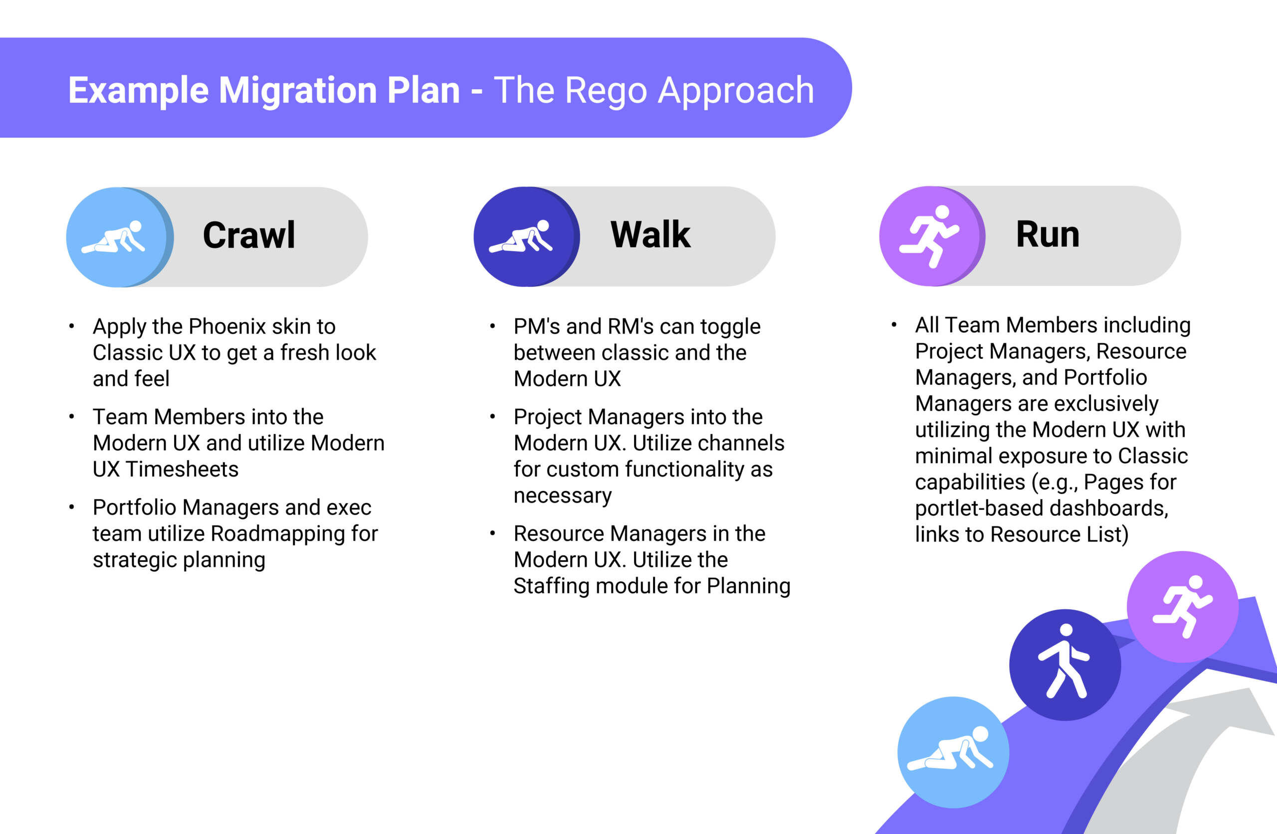
At Rego, we love helping our clients develop migration roadmaps and identifying the best path from Classic to the Modern UX. If you would like help developing a roadmap, contact us to learn more.
Assess Your Current State
As you develop your crawl, walk, and run steps you will also want to assess your current state. An assessment will help you define your baseline and where your organization needs to end up with Clarity. This will also help you identify what features and functionality need to be a focus during migration, as well as things you might not need to bring over to the Modern UX.
Evaluate Clarity’s current state, including:
- Health
- Overall design
- Customizations
- Size/scale
- Users
Then, survey every line of business that uses Clarity about:
- Adoption
- Pain Points
- Gaps
After you have gotten a pulse, you will develop and document your PPM Maturity Roadmap. You will need to define your planning horizon (1 year, 5 years, etc.) and establish a measured deployment approach for each line of business. During this step you will also create an adoption roadmap for Modern UX features by roles or functionality based on specific needs and requirements.
Plan Your Pilot
Next, you will set up a pilot. During the pilot phase, you will engage with Clarity users to gain feedback before your largescale roll-out. This change management best practice will help you discover what works, what needs to be tweaked, gain training insights, and generate higher levels of adoption as participants become collaborators and champions for the migration.
As you develop your Modern UX pilot, you will need to define the following:
What Modern UX modules are included in the pilot
What Modern UX modules are included in the pilot
What resources / teams are included in the pilot
Cadence for feedback sessions
Mechanism for documenting and tracking feedback
Duration of pilot and
go/no-go criteria
Set Your MVP
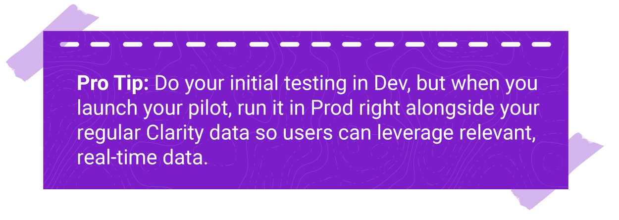
As you prepare for your pilot, you will also want to identify what your Minimum Viable Product (MVP) will be. During this stage, many of the clients we work with end up rationalizing out underused features that might not be adding value.
Try to define what minimum set of Clarity configurations are needed for your organization’s success. The pilot is an opportunity to rationalize fields and only expose elements that are still being used or providing value.
Modern UX Migration Checklist
In addition to the resources above, we have prepared a step-by-step checklist that you can use to get ready for your migration. This checklist includes high-level actions as well as more technical steps that you will need to take.
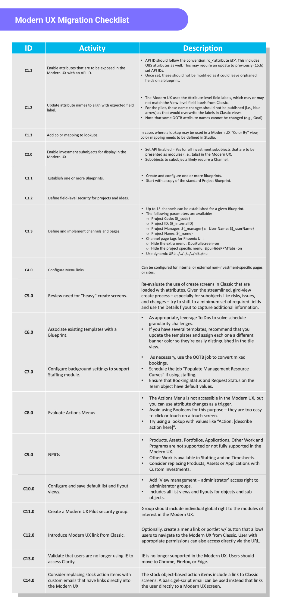
You can also download a copy of the checklist here.
Migrating to Clarity’s Modern UX
Migrating to Clarity’s Modern UX can help your organization drive Clarity usage and adoption, leverage new features, and ensure strategic alignment. Best of all, it is now easier than ever to make the change. By evaluating migration paths, assessing your current state, creating a crawl-walk-run plan, conducting a pilot, and leveraging our checklist, you can prepare for a seamless migration.
And, if you would like help creating a migration plan, Rego can help. We have helped organizations just like yours migrate quickly and efficiently. Contact us today to learn how we can partner with you to develop a Modern UX migration roadmap.

 Organizations that have been using Clarity by Broadcom as their Project Portfolio Management solution for many years sometimes feel nervous about making the move from Clarity Classic to the Modern UX.


